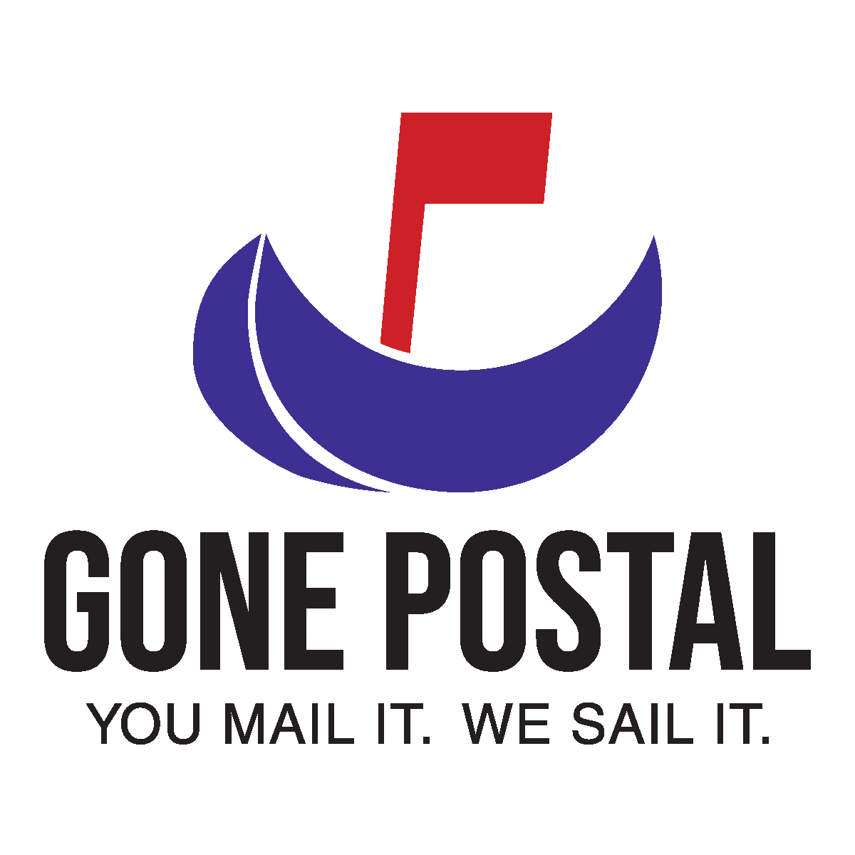
Gone Postal Logo Concept
This project was found through the 99Designs contest website. The client requested a logo that would attract customer attention which focused on a red, blue, and black or gray color palette.
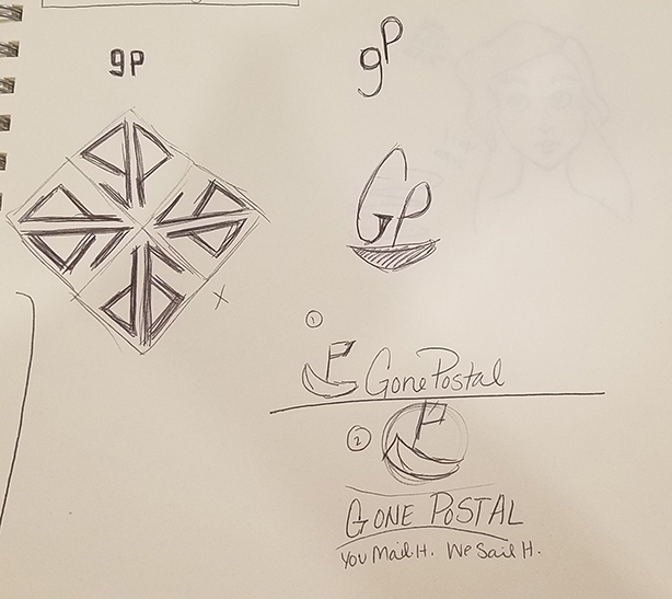
Sketching Phase
Due to the fact that this was a public contest, I was able to take a look at competing designs. I finally decided I wanted to take advantage of the ideas of incorporating a boat and a mailbox flag.
Rough Draft
I initially wanted to create some eye-catching visual interest by warping the text to a shape the complemented the rounded shape of the bottom of the boat. I chose to use red for the flag to strengthen the reference to a mailbox flag. I chose blue in order to call to water and increase the audience recognition for the boat.
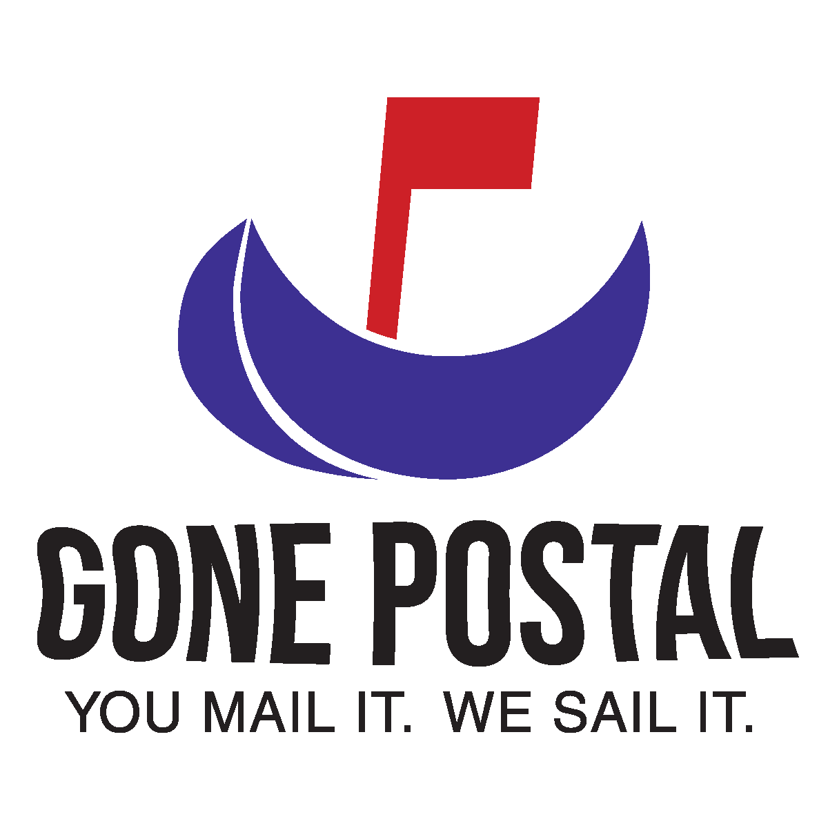
Final Design
I ultimately decided not to use the warped text for this logo as I felt like it was less legible and did not strengthen the design. Using a straight, square font made the text extremely legible as well as lending a feeling of strength and reliability to the brand.