Abbey Road Subdivision Logo
This project was to design a logo for a local subdivision development. The client wanted to include a nod to The Beatles, the band that inspired the name of the subdivision. This subdivision has a focus on older, higher-end clients and I wanted to focus on a design that would appeal to this target audience.
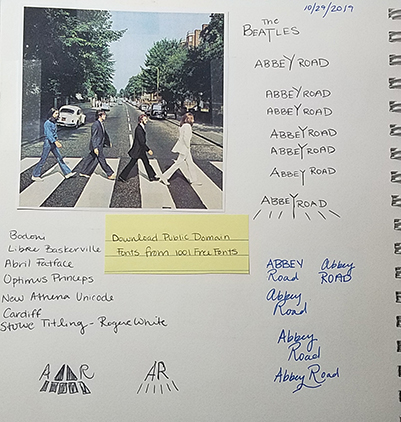
Sketching Phase
I began by researching and sketching my initial impressions. I looked at past album covers, posters, and promotional media for the Beatles. I played with both the ideas of referencing the famous Abbey Road photo shoot and the Beatles logo itself.
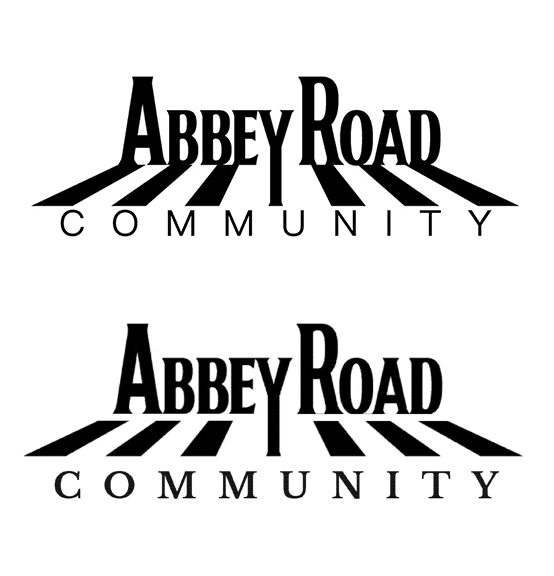
Client Submission
The client elected to provide their own version of the logo. I made slight changes to strengthen their design. I changed the bottom text to a thicker font to support the elements above it, and also changed it to a serif font to repeat the serif elements in the above text. I added white space above and below the 'crosswalk' to make the letters more legible and remove the tangents created in the original logo.
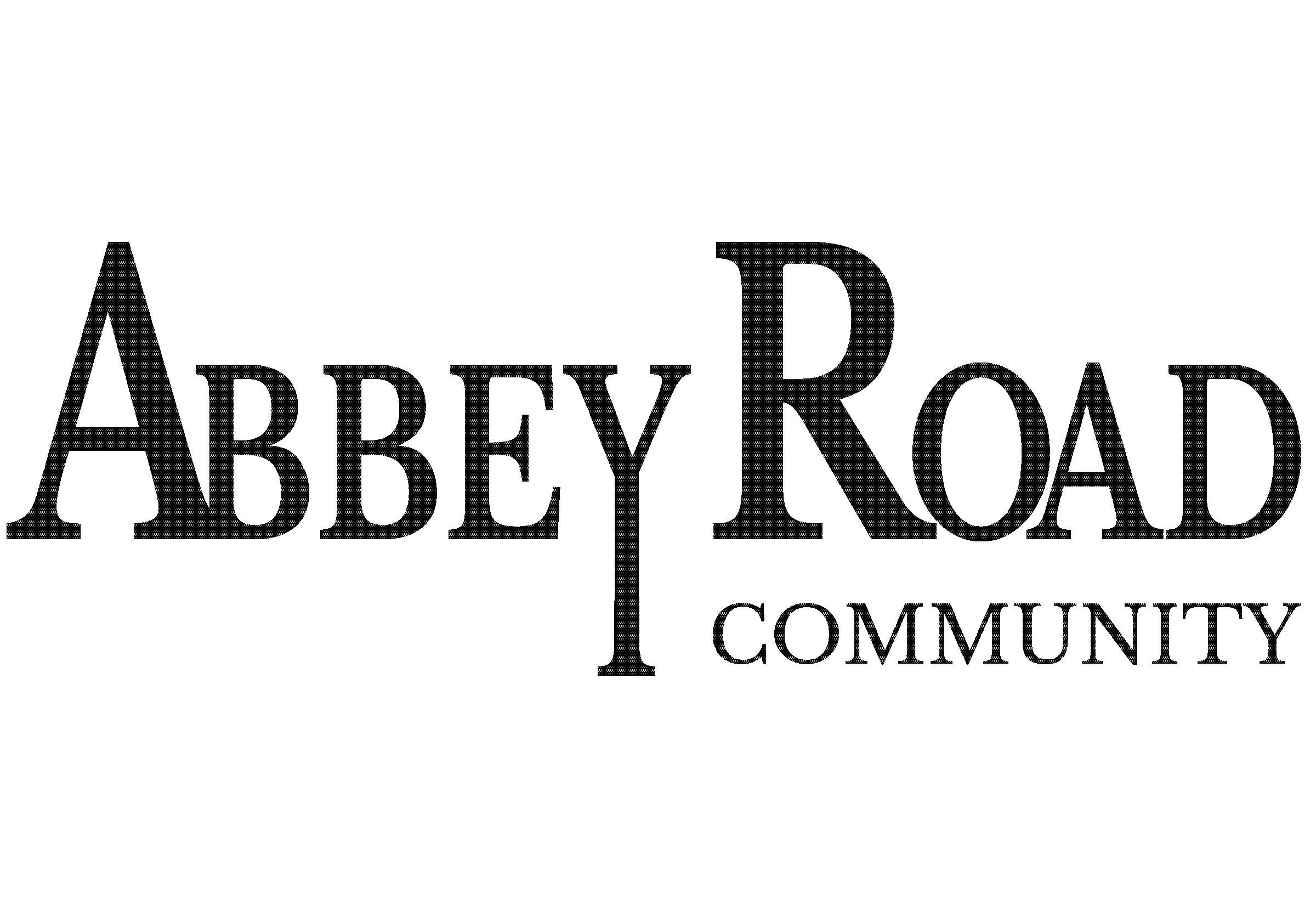
Rough Draft
I decided to focus my original design as an homage to the Beatles logo. I used a serif font as a throwback to the band's logo, but used a slimmer font in order to be able to scale the logo very large without creating overwhelming visual weight. I aligned "Community" to the right to keep the logo legibile and give it more overall stability.
Final Design
This font-based design ended up chosen as the final design and was green-lit to be used on the advertising billboards commissioned for the same subdivision.